AEM Core Components have been available since AEM 6.2, became more stable from AEM 6.3, and AEM 6.4 ships a more advanced set.
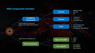
Core Components were introduced to provide robust, extensible base components built on the latest technology and best practices, and following accessibility guidelines. They let developers create flexible, extensible, feature-rich components that make it easy for authors to create content.
Core Components are built with the HTML Template Language (HTL), Touch UI dialogs and Sling Models, and they are secure, robust and versionable.
AEM 6.4 has 16 Core Components — a number that keeps growing with developer contributions on GitHub — in two groups.
Page authoring components
- Breadcrumb
- Content Fragment
- List
- Navigation
- Page
- Quick Search
- Social Media Sharing
- Text
- Title
- Language Navigation
- Image
Form components
- Form Hidden
- Form Options
- Form Text
- Form Button
- Form Container
When to use the Core Components
- New projects should always try to use Core Components.
- Existing projects should keep using the foundation components, unless a site or component refactoring is planned.
- New custom components: check whether an existing Core Component can be customized. If not, build a new custom component following the component guidelines.
- Existing custom components: if they work as expected, keep them as they are. If not, treat them like new custom components.
Foundation component support
The foundation components have been the basis of so many projects across so many versions that they will stay supported for the foreseeable future. Adobe's development focus, however, has moved to the Core Components: new features go there, and the foundation components only get bug fixes.
Advantages of the Core Components
- Written 100% in HTL
- Apache 2.0 license
- Components can be versioned
- Developed in the open on GitHub
- Latest features, with backward compatibility
- Unit test coverage above 80%
Getting started
- Download and install the Core Components.
- Create proxy components.
- Load the core styles.
- Enable the components in the template.
The patterns behind proxy components and versioning are explained in modern AEM component implementation patterns; enabling components happens in the template's policies — see creating an editable template.